If you're a fan of the hit Netflix series, Stranger Things, you're probably familiar with its unique title sequence and retro-inspired aesthetic. As a graphic designer, incorporating elements from popular culture into your work can add a fun and nostalgic touch.
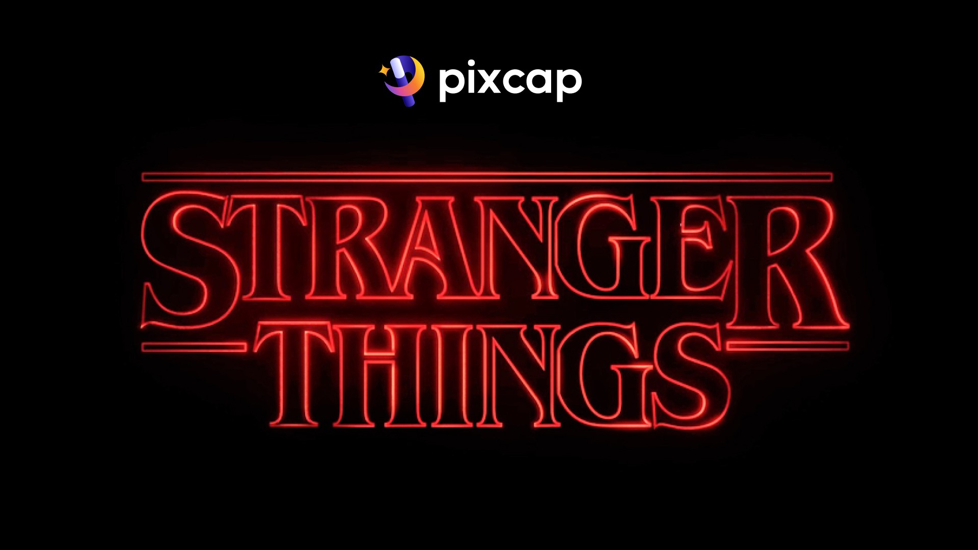
Stranger Things is an American science fiction horror series that has captured the hearts of millions with its unique blend of nostalgia, mystery and supernatural elements. The show's iconic opening credits have become instantly recognizable with their use of retro fonts and logos that pay homage to classic 80s designs.
For graphic designers and fans alike, the hunt for these Stranger Things fonts has been on since the show first premiered in 2016. To make your search easier, we have compiled a list of the top seven Stranger Things fonts that you can use for all your design needs.
7 Stranger Things Fonts for Retro Designs
ITC Benguiat - The Main Font of Stranger Things
The show's primary title font, ITC Benguiat, is a gothic serif created by Ed Benguiat in 1977. The typeface, with its bold and pointed serifs, harks back to classic horror and adventure movies of the '70s and '80s. Its familiar and unmistakable style is integral to "Stranger Things," plastered across title sequences and promotional material.
With its vintage charm and inherent spookiness, ITC Benguiat is a font that screams 'otherworldly.' Literally timeless in conveying an era long gone, it adds a rustic, mysterious and eerie feel to any design project.
Graphic designers can utilize ITC Benguiat Stranger Things font for posters, other art, logo designs, and any content that requires a mystifying or historic touch. Fans might opt to create their own posters and fan art with the font, a perfect homage to the show's opening credits.
Bookman Swash
Even though we all wish Scoops Ahoy, the sailing-themed ice cream shop from Stranger Things, was a real place, it's only found in the show. But here's some good news: you can make your own Scoops Ahoy logo designs using the Bookman Swash font, which is available for free download.
The font, known as ITC Bookman Swash, is a newer version of the ITC Bookman (made by Ed Benguiat in 1975) typeface and is inspired by the old-style Bookman fonts from the 1800s designed by Alexander Phemister. With its casual and playful swashes, it adds a touch of whimsy to any design project.
Bookman Swash font can be used for social media posts, merchandise designs, book covers or any other creative content that needs a bit of fun and nostalgia. And of course, it's perfect for creating your own Scoops Ahoy logo!

Krazy Knacks and Laser
If you're a fan of Stranger Things Season 4, chances are you've really liked Argyle and his big pizza truck. The pizza place he works for, Surfer Boy Pizza, is made-up and part of the show's fantasy world, but the fonts used in its logo are real and you can use them too.
The font Krazy Knacks was made in 2003 by Nick Curtis. He says this font looks like a very exaggerated version of Cooper Black, which fits Argyle's fun and quirky personality perfectly.
The font style is perfect for any fast food inspired designs, retro posters or album covers or even as a headline font for your blog.
Kimberly Stranger Things Font
Continuing our list of Stranger Things-inspired fonts, we've got Kimberly. You might recognize it from the logo of Hawkins Light and Power, and it gives off a strong science fiction vibe.
The straight lines and modern style make it feel eerie, just right for projects that need a bit of a spooky, futuristic touch. Kimberly is what you'd call a "techy-looking" font without any fancy curves, which goes really well with the Stranger Things theme.
Try it out for your next sci-fi or technology-related design project and see how it amps up the overall feel.

Serpentine Sans Oblique
If Steve 'the hair' Harrington and Robin Buckley are your favorite characters, then you'll likely remember the font from the Family Video Store sign as Serpentine Sans Oblique. Even though the sign adds some extra flair (like the letters being stretched out), this free font is what it's based on.
Serpentine is a popular font choice for movie and TV show titles, especially those with an 80s or retro vibe. The oblique version adds a nice slant to the letters, giving them a more dynamic look.
If you're going for that throwback feel in your designs, Serpentine Sans Oblique might just be the perfect choice. It's bold, fun, and instantly recognizable for Stranger Things fans.

Daydream Stranger Thing Font
Eddie Munson, a character from Stranger Things, became incredibly popular with fans when he was introduced in Season four. Throughout the season, Munson always wears a 'Hellfire Club' T-shirt that features a rough version of the Daydream font.
The Daydream font has a fun, old-school vibe, reminiscent of the 1970s. It was designed by a unique font company called Volcano Type.
If you want to design a T-shirt or poster inspired by Eddie Munson's iconic look, the Daydream font is a must-have in your collection.
Rogue Sans Nova Bold
Talking about T-shirts in the show, when Dustin comes back from "Camp Know Where" in season three, he's sporting a T-shirt with a cool, old-school design. The shirt's design uses the Rogue Sans Nova Bold font, which interestingly combines a future and past vibe all at once.
Although it might be a bit pricier than other fonts, the Rogue Sans family is worth the investment because of its fascinating history and trendy appearance.
Whether you're designing T-shirts or posters created for an 80s themed party or event, the Rogue Sans Nova Bold font is perfect for capturing that nostalgic feel.
If you're feeling inspired by the fonts used in Stranger Things and want to explore more options, there are plenty of free retro fonts and hand-writing fonts available on Pixcap, or you can also upload your fonts to use in your designs —> START DESIGNING NOW


